SoCIETIE: Brand Identity
Group Project
Moby Westwood
Hugo Su
2024
For our project we collaborated with Chris Browne the founder of the SoCIEITE Initiative, an initiative that will be launching, with partnership from the McCuster Institute, January of 2025 within the Australian National University (ANU) Campus. The SoCIETIE Initiative is an alternative learning program that focuses on community outreach and social change. SoCIETIE will run through an alternative learning program that presents courses more freely than the current curriculum, focusing more on building transdisciplinary skills and community focused projects. To aid in the projects outreach and identity our team was asked to create a brand identity that reflects SoCIETIE’s ethos. The final deliverable was a brand book that compiles the logo suite, colour and font choices, SoCIETIE’s mascot Knox, Digital badges, mockups/example integrations and an ANU alignment section. The brand book created would then be further expanded upon after the finalisation of the project
As a group we decided that the first item that we should tackle before moving forwards was the logo suite to give a basis for the brand’s visual identity.


Logo Suite
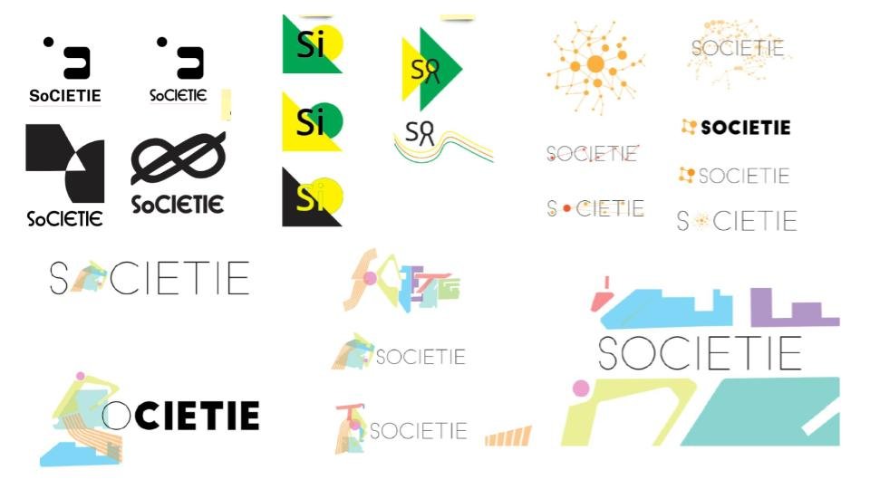
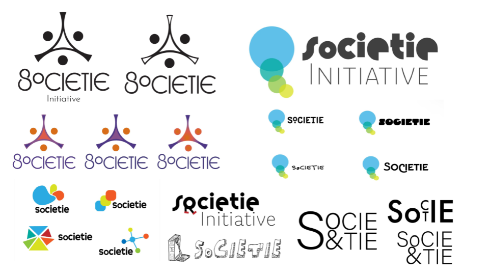
During this iterative process we went through a lot of logo variations with Chris. Due to the large qauntity of ideas presented our group decided to go with this final iteration that represented the key message of SoCIETIE.

The logo is an abstract representation of the Sully River that connects ANU campus to the outer Canberra community. Through the utilisation of organic shapes it represents the river’s flow and correlation to the winding path of growth the initiative will provide to its participants. Another element that is represented within the logo is a key part of SOCIETIE—KNOTs. These KNOTs act as the foundation to each skill gained within the initiative and their main message to “Know the Nature of Things.”
The inclusion of the ascending pods acts as a visual representation of knots tied into a rope. The last element that is integrated into the logos construction is the correlation to a hub and spoke system. As these systems often are used for representing connection, conversation and community our group found it integral to incorporate within the logos meaning. The combination of these different elements within the finalised logo creates a dynamic and unique logo mark that encompasses all aspects of the initiatives ethos
After finalising the logo our group then made Knox, the mascot for SoCIETIE.
The metaphor behind Knox draws from rich symbolic references, blending the monkey’s fist and the Gordian Knot to represent a problem that tightens the more you pull at it— an intractable challenge requiring a shift in thinking to resolve. Knox’s design reflects this idea that only a fundamental change in approach can untangle such problems by having the loop be such a promenade part of his character.
Additionally, Knox’s body is made of Gödel’s Loophole, a mathematical metaphor highlighting how initial breakthroughs are the hardest to achieve, but once done, subsequent solutions become easier. Together, these symbols create a powerful narrative: Knox is not just a problem, but a challenge that demands bold, unconventional thinking to solve—once cracked, everything else falls into place. Knox can be utilised to represent the student participants, creating a more personable connection with the target audience.

The Final Brand Book
Video walkthrough showing the brand book in its entirety.
During the design development our team was made aware that due to the Australian National University Guidelines our design may not be utilised; however, to combate this we included an ANU adjacent section within the Brand Book.
For further analysis and justification the Project’s reflection and evaluation has been provided here.
